Autumn in the Rocky Mountains 1

Autumn in the Rocky Mountains 1

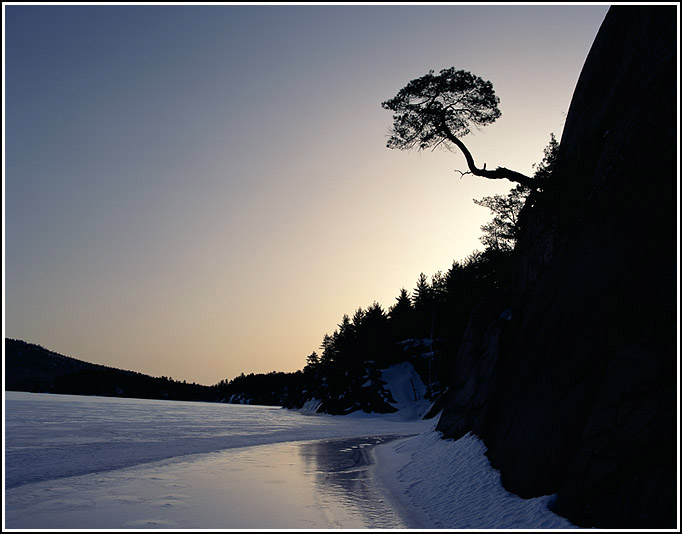
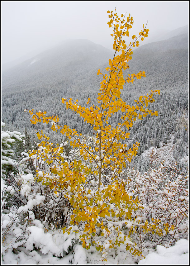
This image was taken near Mount Edith Cavell in Jasper National Park, Alberta. An early snowstorm was dumping a good blanket of snow on the area.

A major adrenalin rush!

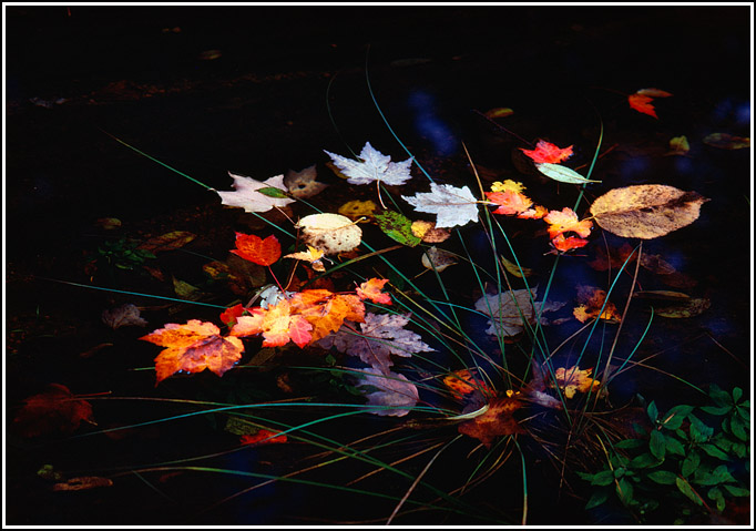
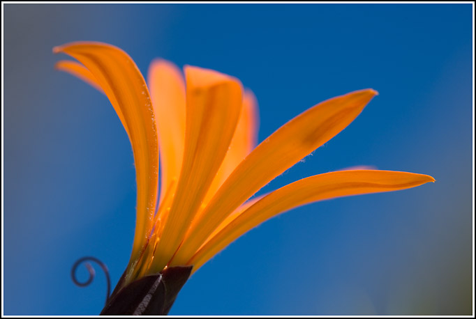
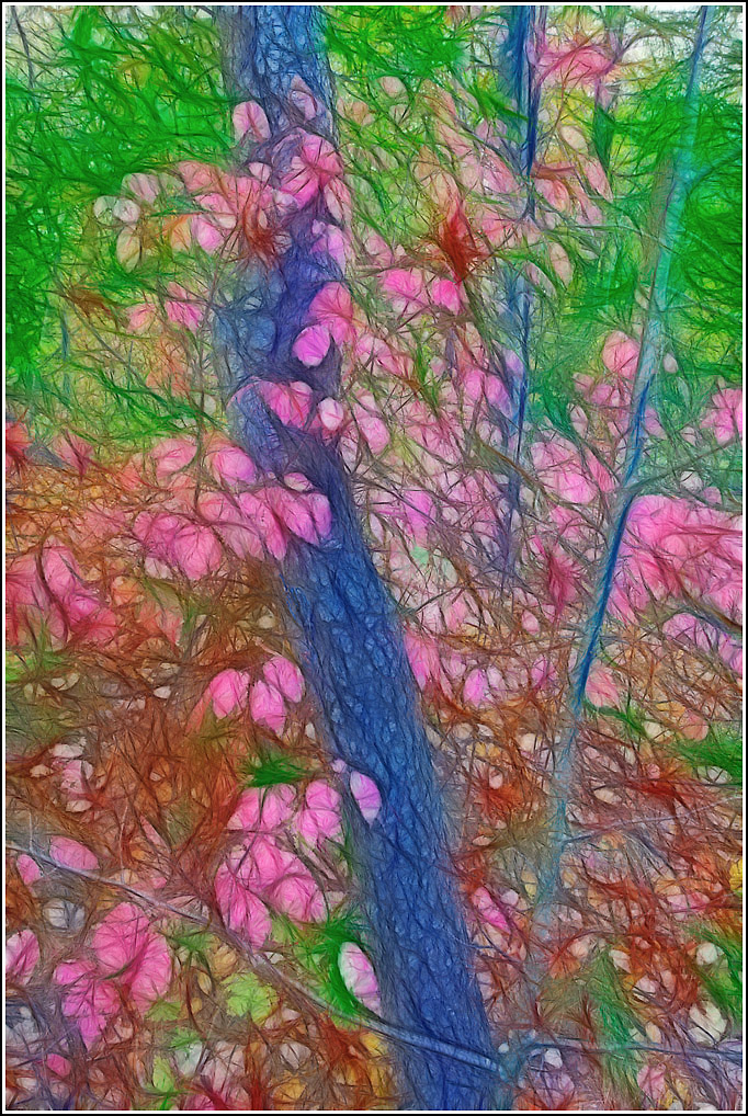
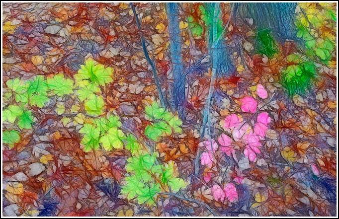
Robert Frost once said: “You cannot get too much snow in winter.” As a photographer I would add to that: nor in autumn. Snow on autumn leaves is pure eye candy.

The challenges under these conditions are more with driving and survival as with photography. You’re excited and you want to find your next shot quickly before it all melts. But you still have summer tires. And you’re on steep, smoothly paved, icy road.

Tricky scenario!

Photographic tip: bring a bag of sand, a blanket, food and water and a cellphone. In other words: prepare to end up in the ditch.

We made it to Cavell Lake. Sometime during the last century I got a nice sunrise on Mount Edith Cavell from here but today Ms Cavell is lost in a snowy blizzard.

This image was taken with a 17-40 Canon zoom.

I did not use the tripod – it seemed too dangerous to spend much time here. Bright conditions and the use of the wide-angle made it less critical to use the tripod.

http://www.naturephotos.com
http://www.petervanrhijn.com

Colour 5

Colour 5

Photoshop rescue.

In Photoshop I made a selection of the Indian Paintbrush. Photoshop’s ability to do this in semi-automated fashion is uncanny.

I inversed the selection so that the whole image was selected minus the Indian Paintbrush. Then I simply desaturated the rocks to neutral grey-black. We’ve just left planet Earth.

Suddenly the image had a modern look. It seems all the rage to play with Photoshop’s ability to let us make quick and accurate selections and alter the appearance of images in different ways.

Apart from the fact that we have fixed the colour clash, it is also the ‘unusual’ quality that makes this work. As we overuse this effect, the ‘unusual’ will wear off and it will cease to help images.

Such is life. ‘Homo Ludens’ forever.

http://www.naturephotos.com
http://www.petervanrhijn.com

Colour 4

Colour 4

This image shows some some autumn leaves, knocked off by a rainstorm, caught in some grass in a shallow pond.

A polarizer filter was used to get rid of the unwanted reflections in the water and to saturate the colours of the autumn leaves.

This image reminded me of a possible cure for the (earlier today) Indian Paintbrush image: saturated red and black go well together. A lightbulb went off in my head…

http://www.naturephotos.com
http://www.petervanrhijn.com

Colour 3

Colour 3

This unfortunate bright red Indian Paintbrush lives in the high slick-rock desert. Quite a survivor. Nearly all rocks are rusty red and there is almost no green vegetation to hang out with. It’s very dry.

This is one of the rare examples of clashing colours in nature, at least clashing to the human eye.

Why did I bother shooting this? The composition was strong and I was hoping this would be a redeeming factor. The flower fit nicely in the strong point and the leading line was powerful. More on this later today.

http://www.petervanrhijn.com
http://www.naturephotos.com

Colour 2

Colour 2

This is the Fuchsia Magellanica (Chilco or Aljaba.)

This pretty flower/bush seems very much at home in south to middle Patagonia and I suspect it is native here. Considering its distribution, it must be quite frost resistant.

This is simply a happy colour combination: green and red work well together. This specimen grew next to a white wall which acted like a perfectly soft reflector.

Placement of the flower is in the left lower strong point and a single circle of confusion on the right gives some balance.

http://www.petervanrhijn.com
http://www.naturephotos.com

Colour

Colour

A previous post was about colour HARMONY. Colour harmony strengthens images by repeating the colour of the main subject in the background.

Colours can also help an image if they simply fit well together. Think of the old colour wheel. Colours at opposite positions on the colour wheel tend to be good matches and can help an image succeed as well.

Look at this Metusia Naranja. This is mainly a ground-hugging vine. It is Patagonia’s flower symbol so it seemed important to get a strong image of it. I tried using colour harmony (with another Metusia in the background) but their messy growth habits made that very hard.

So I was on the lookout for a specimen high enough so I could get below the flower and get a mainly blue sky as my background. Outside St. Martin de los Andes there is a nice hiking trail going up to Cerro Colorado. Not a very impressive Cerro but a great hike and a great view. On the sunny climb up, a Metusia was patiently waiting for me as it was ‘reaching for the sky’, posing at the top of a bush. This was the glamour shot I had been waiting for.

Good colour combinations are (very briefly) Orange and Blue, Green and Red, Yellow and Magenta.

Another consideration is that strong saturated colours are harder to combine than muted colours. Finally the good news: clashing colours are not very common in nature. But more about that in the next four postings.

http://www.petervanrhijn.com
http://www.naturephotos.com

Killarney Winter

Killarney Winter

Killarney Provincial Park is located near the northern tip of Georgian Bay, Ontario.

Killarney is beautiful and popular.

I wanted to experience silence in Killarney to get a real feeling for the place. So I went in winter and I went alone. My skis, my camera, and I.

I found the park just as the doctor ordered: closed and deserted. I camped out in the parking lot and had an early start the next day on a beautiful clear morning. A few days earlier there had been a huge volcanic eruption (Mount Pinotubo) in Indonesia. Volcanic ash had spread around the world. The sky had a coppery red glow that day. It was eerie but added to my sense of adventure.

The skiing was incredible. The ice had a thin layer of old snow on it and it was perfect for freestyle skating. This was early digital age so I still carried my trusted old Mamiya RZ 67.

This image was taken around 9 am. along the shoreline of George Lake. I only got about three good images that day but the mental image of skate-skiing all around Killarney on a copper-sky day is burned in my memory like the best image I’ve ever taken.

http://www.petervanrhijn.com
http://www.naturephotos.com

Autumn Along the Humber River

Autumn Along the Humber River

The Humber River is in Toronto’s west end. The river with its wide flood plain creates a nice recreational ravine, used extensively by cyclists, pedestrians, picnic-ers and in-line skaters.

Autumn, like autumn in most parts of Ontario, is very pretty here. Not far from my house there is an area with bushes – which I have yet to identify – which turn a vivid magenta in autumn. The bushes are surrounded by black cherry trees.

This image shows these bushes. A Fractalius filter has been applied partially (the filtered version and the original version are blended together) to give this image a slightly soft and impressionistic look.

http://www.petervanrhijn.com
http://www.naturephotos.com

Autumn Magic

Autumn Magic

This image was captured on a hike in the Rocky Mountains a couple of years ago.

One thing nature photography has taught me is that clashing colours are very rare in nature no matter how vivid they are.

I can recall only two nature images I have taken – out of thousands – where I perceived a colour mismatch that was disturbing.

Another hint proving that nature is the ultimate art teacher.

http://www.petervanrhijn.com
http://www.naturephotos.com